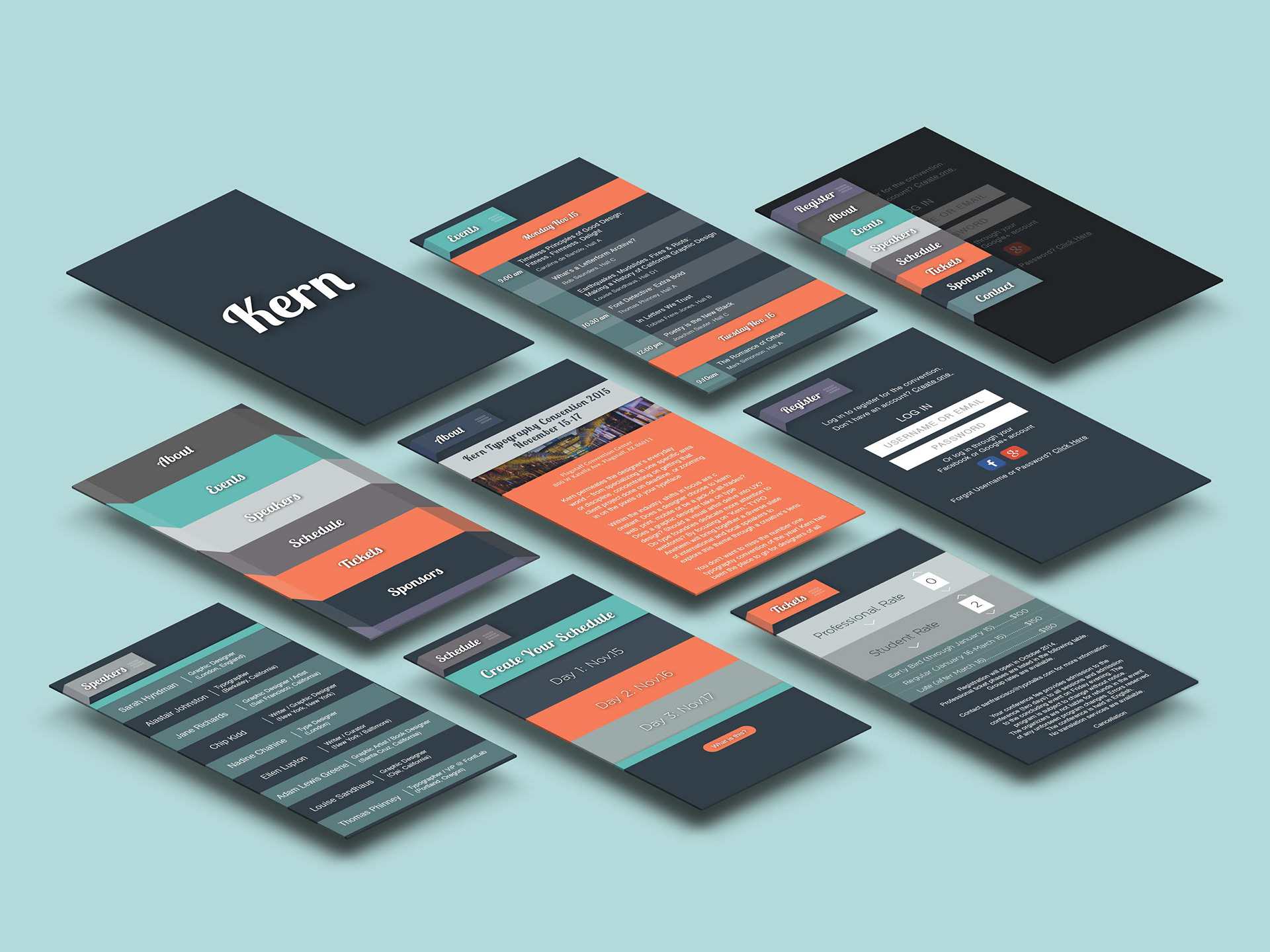


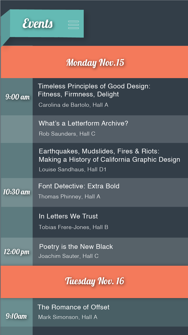

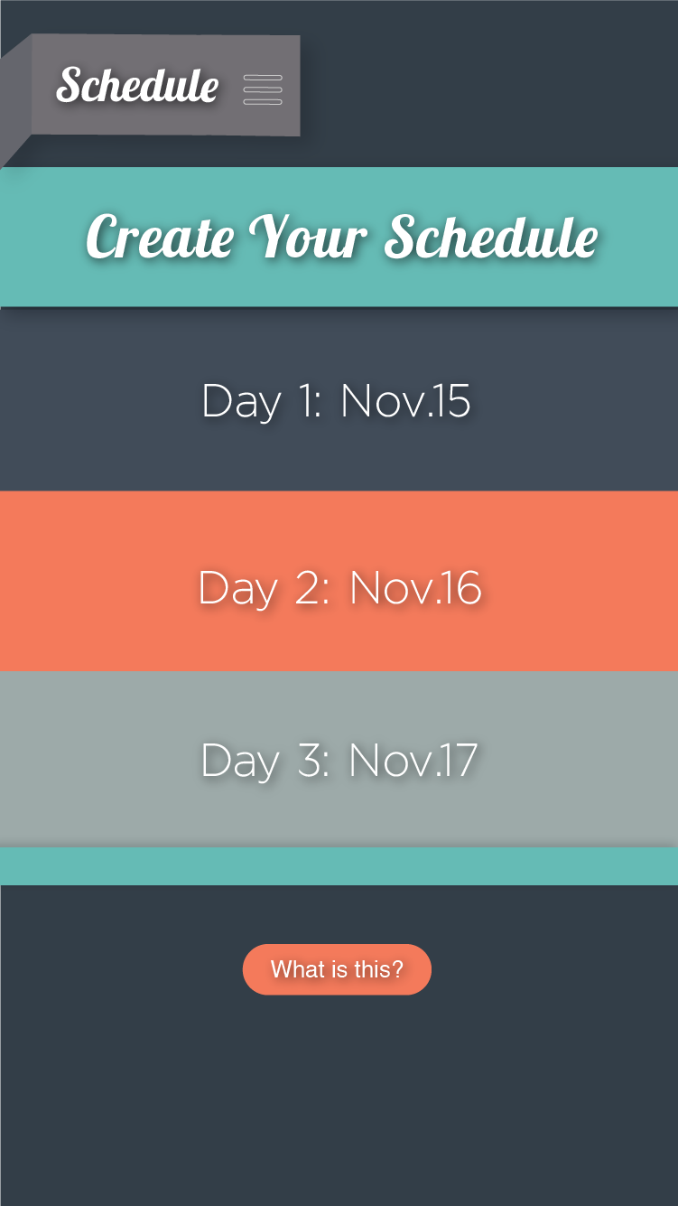

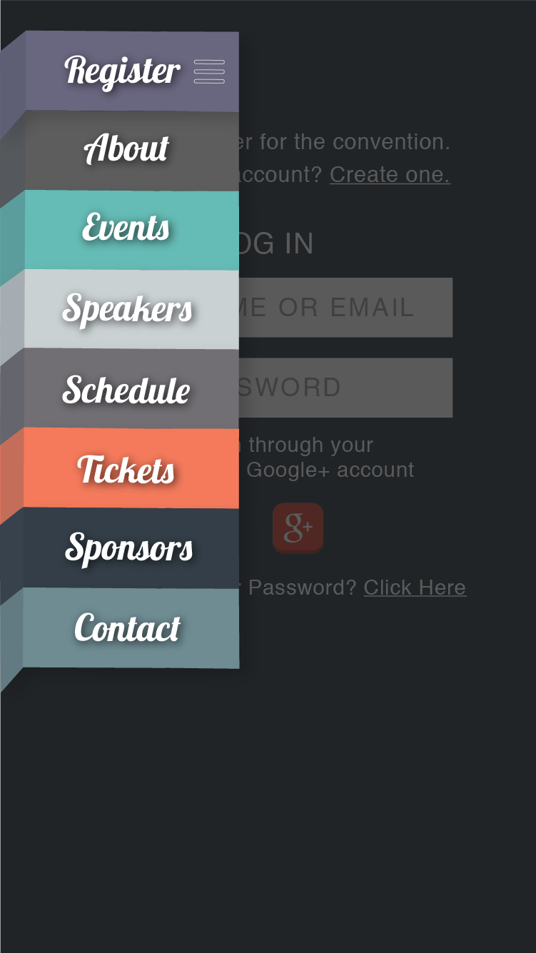


This app was created for a typography convention called Kern. Being an app for a typography convention, the type used throughout is the most important aspect to me. I chose a color scheme and use of horizontal lines for organization that resembled the Bauhaus movement for design back in 1919 because of the unique take on layout and typography that the style brought to design. I decided to make the navigation and header font a thick, serif with the body text being a more sleek, modern sanserif to create hierarchy throughout the app.