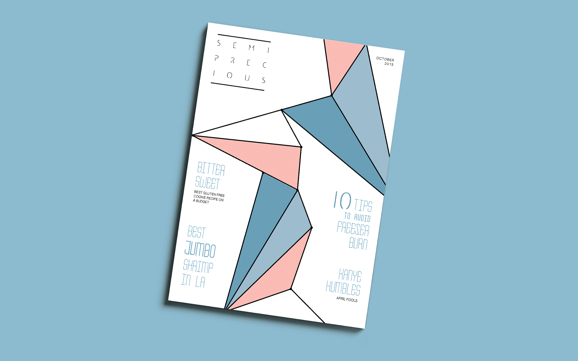
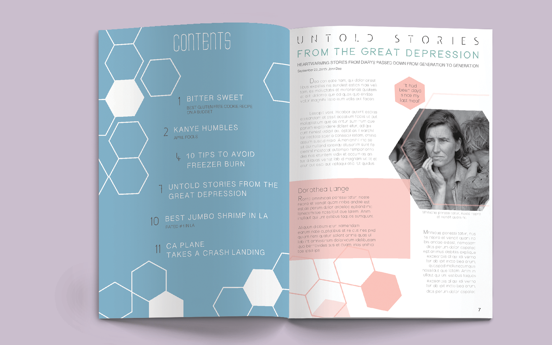

This is a magazine concept called Semi Precious where our goal as a class was to design two spreads and a cover using the theme of oxymorons. I chose to use a lot of geometric shapes since oxymorons are typically a blunt statement. I tried to capture this feeling through the use of sharp objects with a high amount of contrast which is why some of the shapes are filled while others are empty. Since oxymorons are phrases of opposite meaning becoming one understandable statement, I feel this is a way of depicting that visually. Because there are such harsh lines and corners, I wanted to balance that out with a softer color scheme of pastel blue coral and orange with white. Also I chose a thinner, sans serif font to match the use of line throughout the design.