


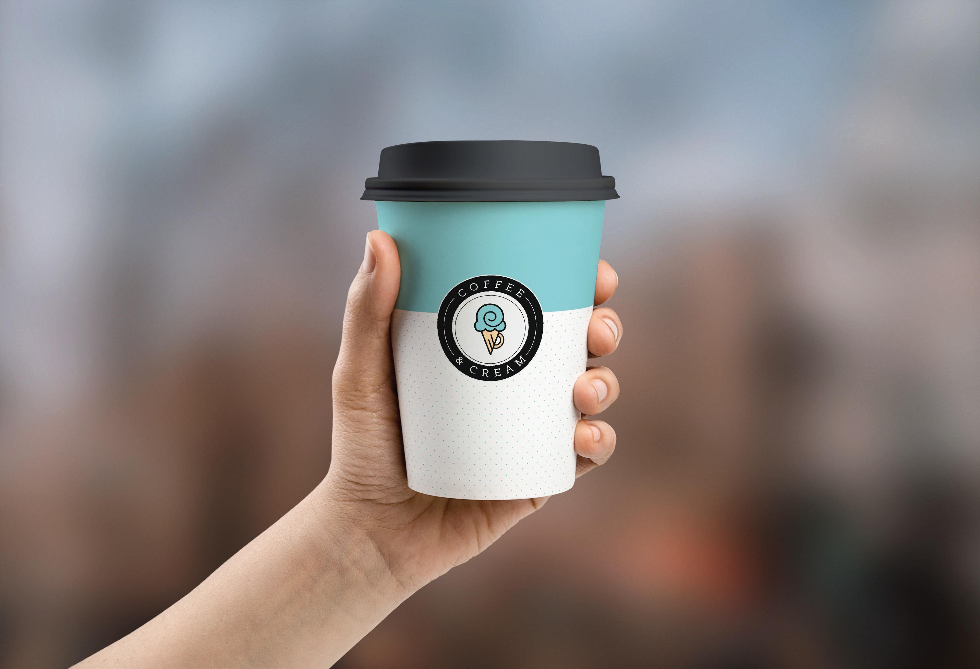
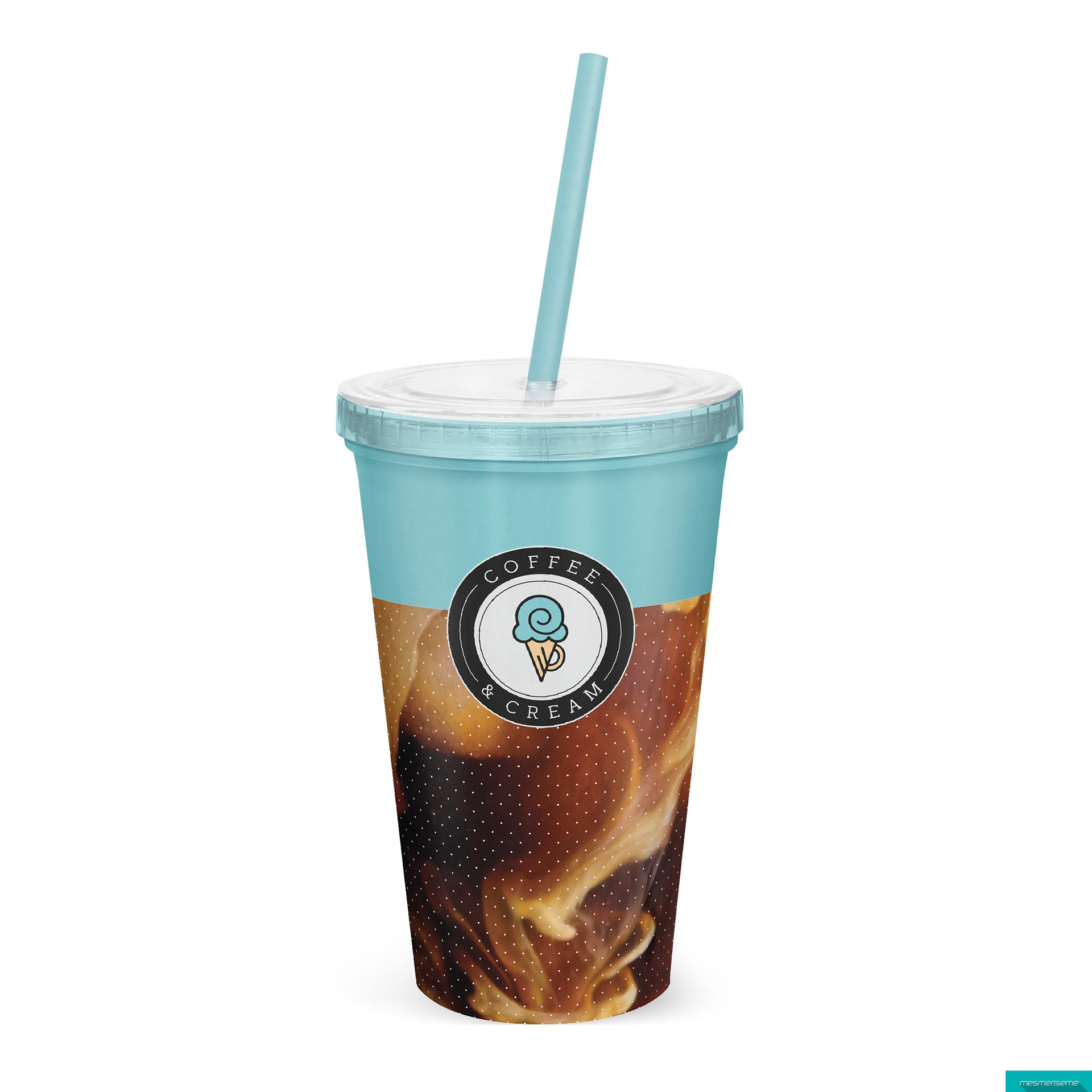
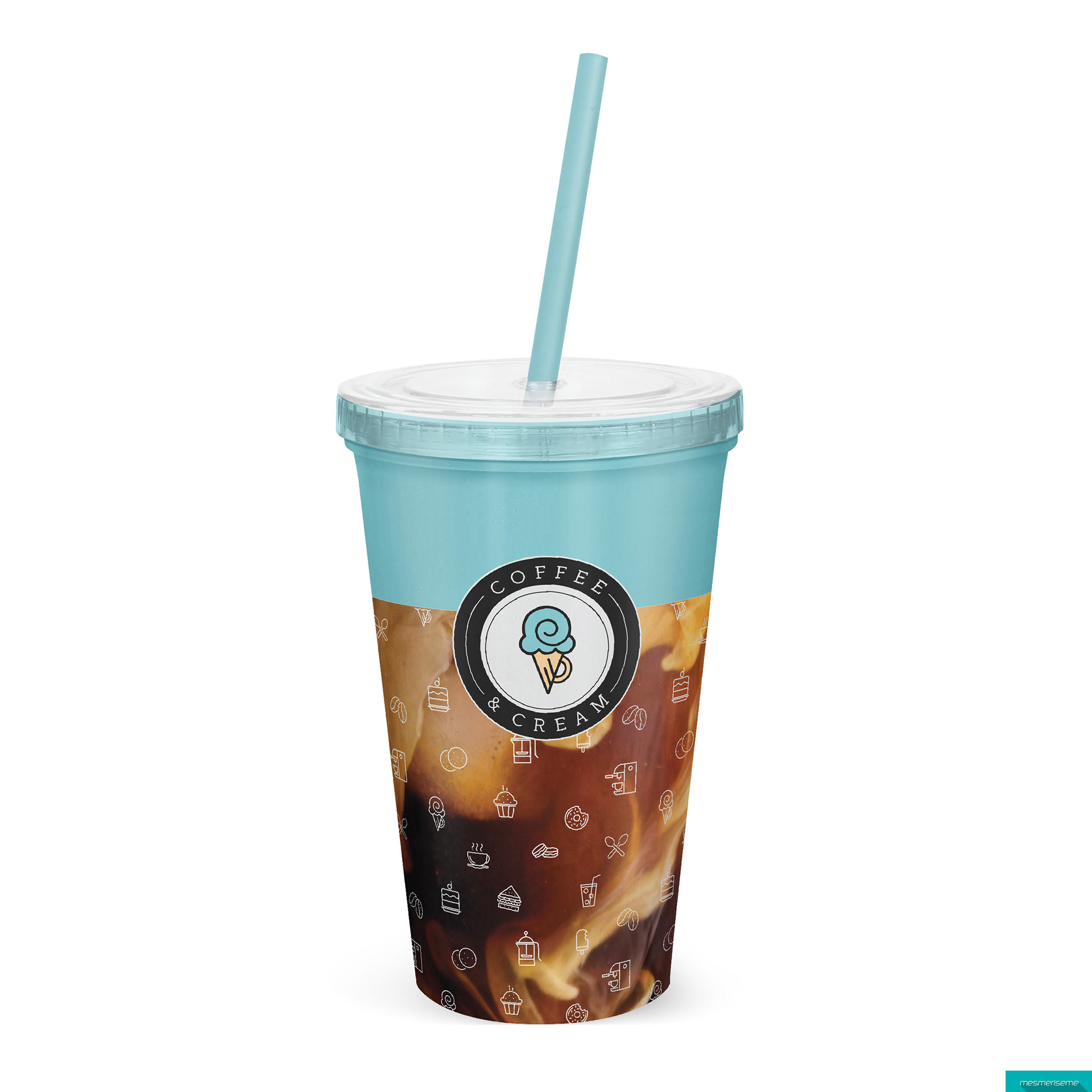

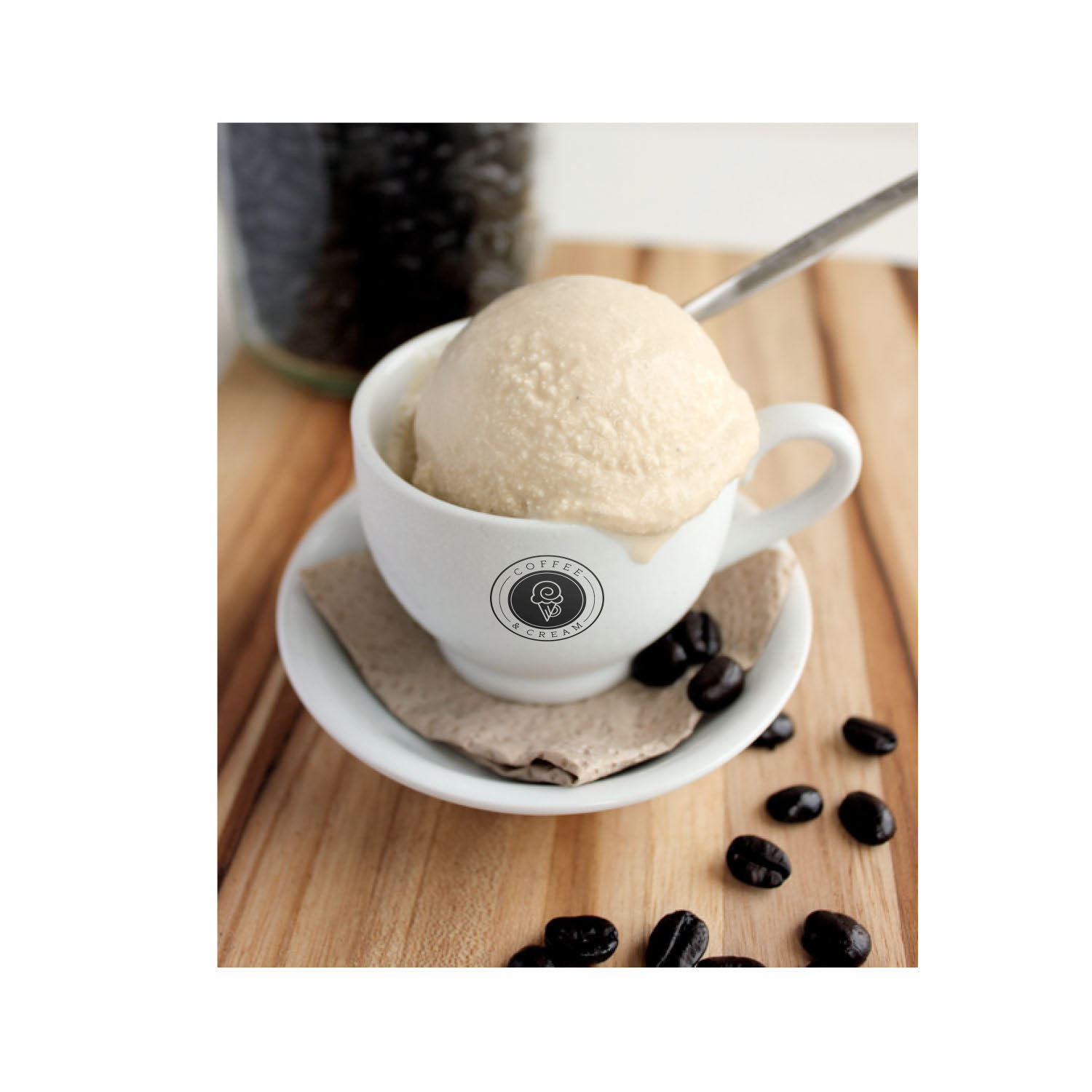

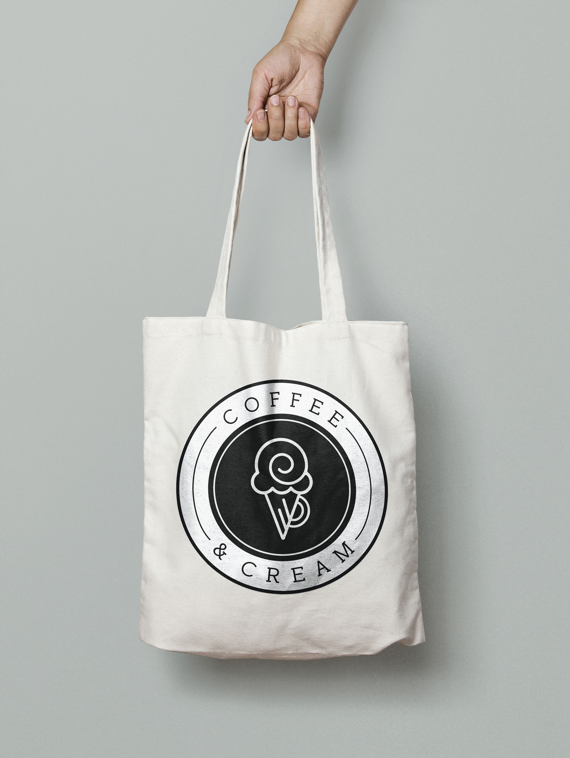

I decided to bring to life my idea for a coffee shop that also serves ice cream called Coffee and Cream. I thought of this name because of the idea of coffee and creamer, as well as coffee and ice cream, making it a play on words. First off, I am very proud of the logo design because it perfectly incorporates the idea of ice cream and coffee, seeing as though it’s an ice cream cone with a handle like a mug. I wanted a strong contrast between light and dark with a pop of color which is why I chose a “Tiffany Blue” inside a black and white emblem. I wanted to carry that color scheme throughout the rest of the brand, like using the blue for the top portions of the products, to help keep them tied to the logo. I also wanted to continue the thin nature of the font within the logo into patterns used in the packaging designs. One of the patterns includes everything you can find at this coffee shop, like ice cream, pastries, coffee, tea, and sandwiches, portrayed through illustrated, thin icons, while the other are small dots. The main ice cream illustration in my logo is also used throughout the store like on doors, seats, and other items. Overall, I have had this idea for a coffee shop brand for a while and it is amazing to see it come to life.